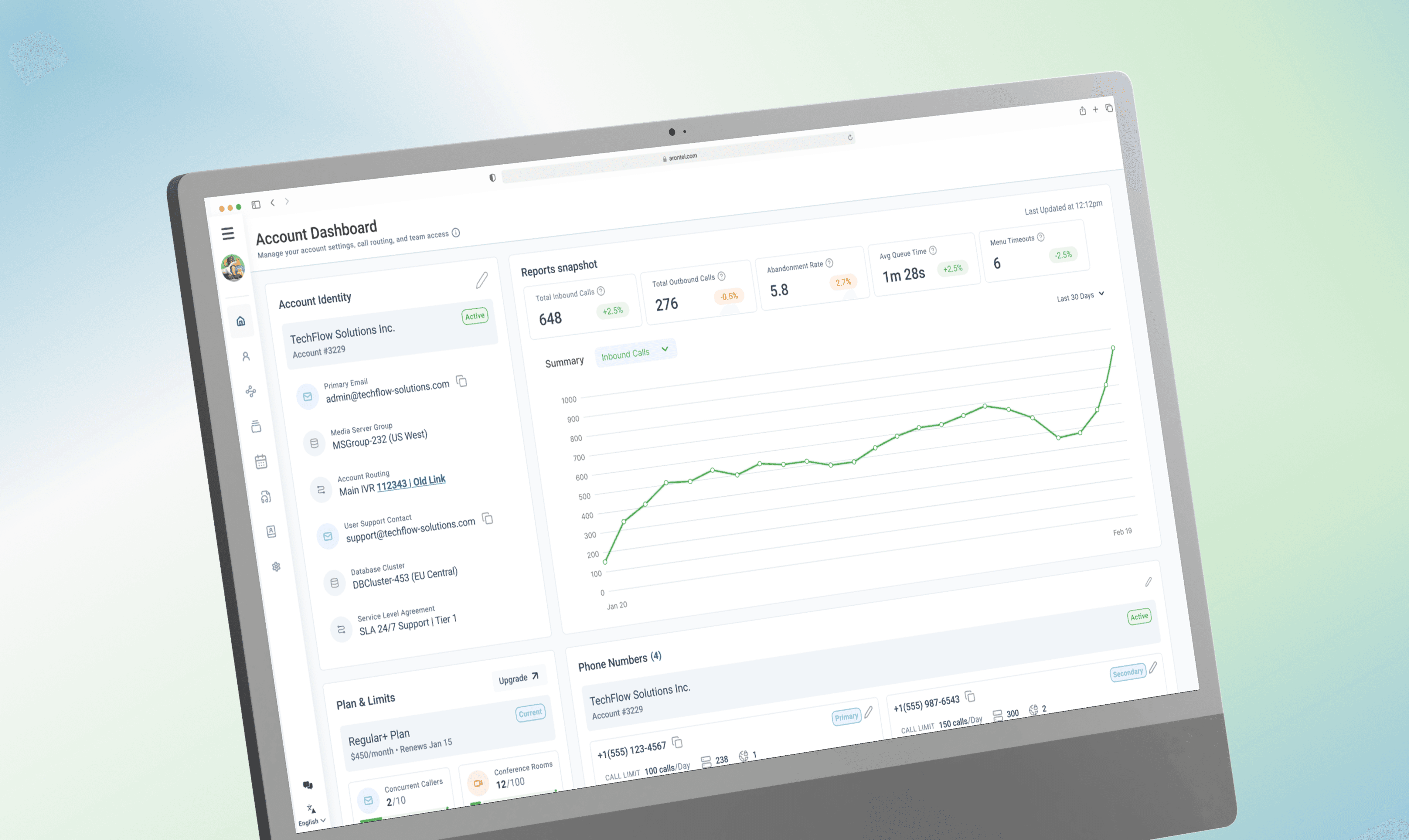
Arontel Account Command Center
A dashboard that helps Ops teams spot risk fast, act faster, and prevent failures before calls drop.
8 min read
TIMELINE
Nov 2025 – Jan 2026
ROLE
Lead Product Design
DISCIPLINE
Product Strategy
UX Research
Interaction Design
Systems Thinking
Design Systems
TOOLS
Figma
Storybook
Maze
Zoom
Jira
Notion
WCAG Guidelines
Table of Contents
1
The Problem Space
2
The Solution
3
Research & insights
4
Strategy & system thinking
5
5 iterations toward governance
6
Future Plans and Learnings
An IVR misconfiguration doesn’t “hurt engagement.” It drops real customer calls.
And the worst failures don’t look dramatic — they show up as quiet thresholds creeping upward until it’s too late.
Volivr started as a dashboard redesign, but quickly became something more urgent: a system that tells operators what matters right now — before failure becomes an incident.

The challenge
How might I transform a static IVR account dashboard into a proactive system that surfaces risk, structures urgency, and guides action before failure occurs?
Ops teams had access to data. They didn’t have a reliable way to prioritize it under pressure. That gap created delayed response, missed thresholds, and avoidable support escalations.
HIGH LEVEL GOALS
Predict capacity and routing breakdowns before thresholds are breached.
Enable fast recovery by pairing alerts with clear next steps.
Reduce time to critical issue identification
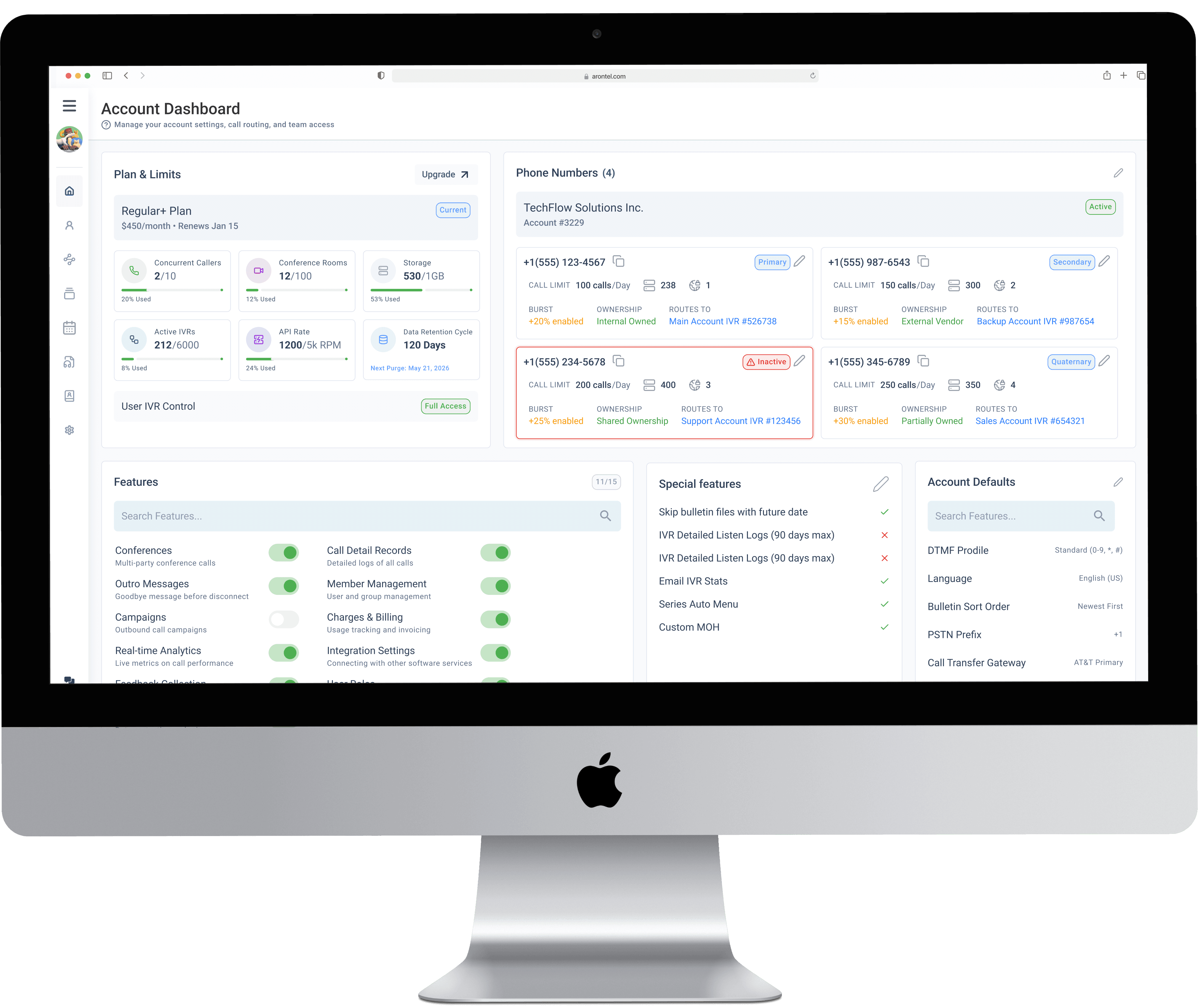
Solution
Command Center that reflects the shift from passive monitoring to operational control.
Volivr doesn’t try to be a “single place for everything.”
It doesn’t add more metrics to feel comprehensive.
Instead, it behaves like an operational cockpit: it prioritizes risk, forecasts failures, and turns alerts into actions. Operators shouldn’t need to interpret a wall of numbers to protect SLAs.
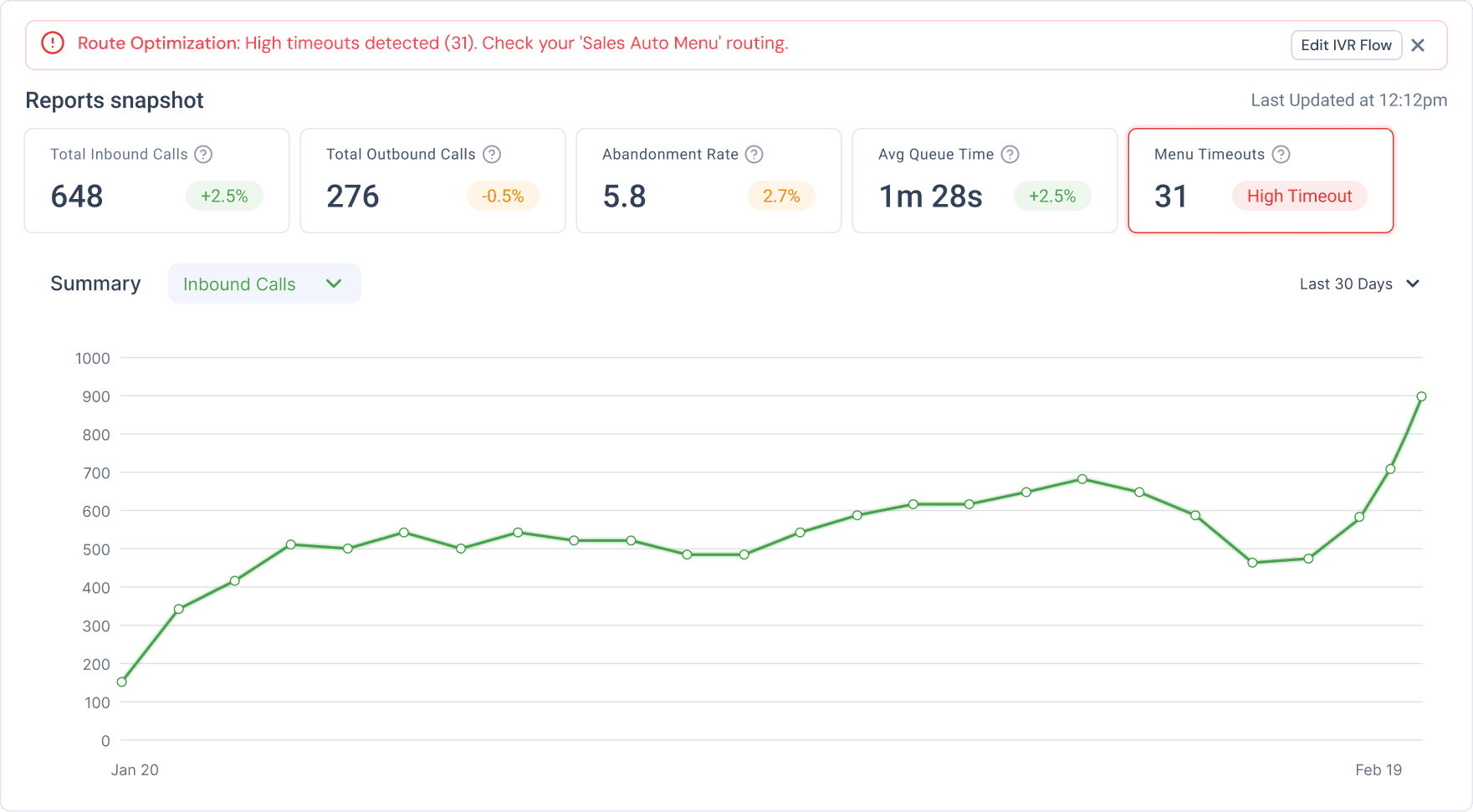
Predictive Capacity Alerts
Threshold alerts tell you when something is already broken.
Volivr forecasts exhaustion based on usage trends (e.g., “Full capacity in 4 days”). This gives Ops teams time to upgrade plans or clear storage before call recordings fail.
Design decision: I prioritized prevention over precision. Forecasting doesn’t need to be perfect — it needs to be early enough to act.
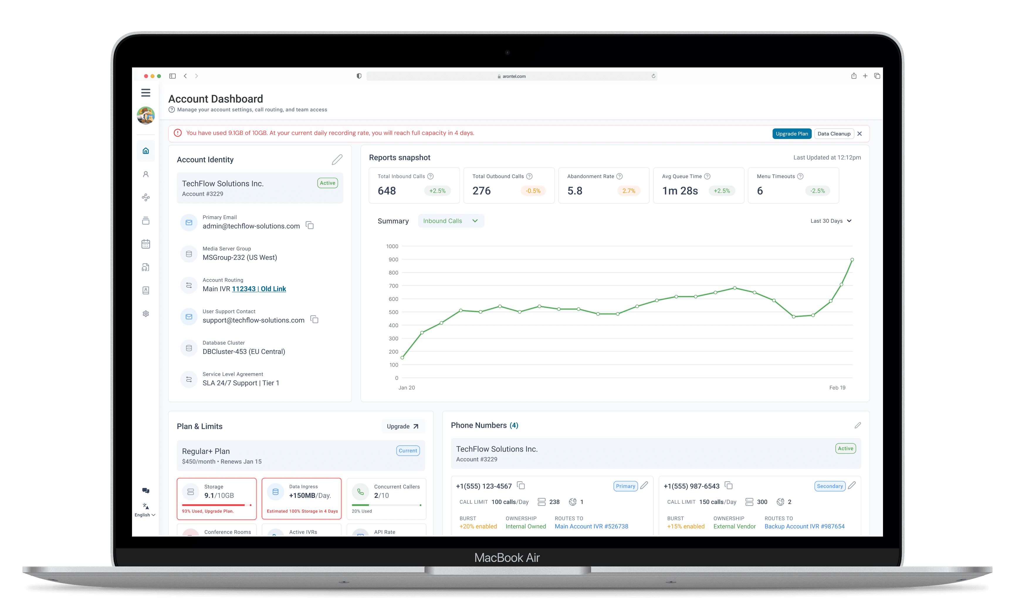
Action-Coupled Alert Banners
Alerts often create anxiety without helping resolution. I refused to ship “awareness-only” warnings.
Critical alerts include direct remediation paths like Upgrade Plan, Run Diagnostics, or View IVR Flow. The goal is momentum under pressure.
Design decision: If an alert exists, it must answer: What should I do next?
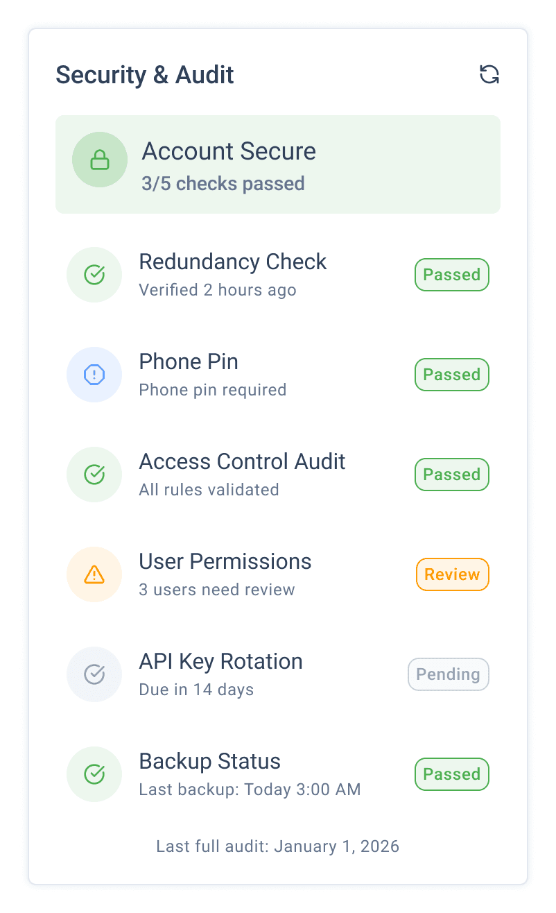
Severity-Based Risk Modeling
Percent change alone doesn’t communicate impact. A -8% metric could be noise or an SLA threat.
Volivr assigns states (Healthy, Warning, Critical) based on thresholds tied to operational limits and SLA contracts. That makes red meaningful: it signals customer impact, not just “down.”
Design decision: I anchored color to contracts and limits so teams could trust what they were seeing.
User Research
I wasn’t looking for feature requests. I was looking for pain points under pressure.
What surprised me
72% of participants scanned all metric cards before identifying the critical risk.
That’s not a “user error.” That’s a system design failure.
Insight: When everything looks important, nothing is.
Implication: I needed a hierarchy that could carry urgency for the user — not ask them to manufacture it.
Stakeholder interviews (Ops + Support + CS)
Support ticket pattern audit
Maze validation with Stakeholders
Usability testing
Atomic Design Principles
TURNING POINT
Early versions made the interface cleaner, but teams still hesitated.
The turning point was realizing: clarity isn’t enough in operations — you need urgency structure.
That’s when I introduced severity modeling and changed the role of color from decoration to decision logic.
Design
Design Trade-offs That Shaped the Product
I chose to prioritize:
Prevention over reaction
Hierarchy over comprehensiveness
Actionability over information density
I deliberately avoided:
“Everything in one place” thinking
Passive reporting patterns
Visual decisions not tied to operational thresholds
Prototype
Iteration arc (5 rounds, each tied to a usability breakdown)
The system evolved through three major cycles:
Iteration 1–2: structural clarity (organized cards, grouping, scanability)
Iteration 3: metric delta visibility (trend cues and change awareness)
Iteration 4: threshold alerts (make breaches visible)
Iteration 5: predictive governance + severity modeling (make urgency actionable)
What’s Next?
This project shifted Volivr from reporting to decision support
IMPACT & OUTCOMES
This project shifted Volivr from reporting to decision support.
Operators identified the critical issue faster (40% reduction in time)
Recovery workflows became smoother (32% faster completion)
Usability improved meaningfully (SUS 52 → 78)
Trust increased (NPS jump + stronger confidence language in feedback)
What’s next?
Alert lifecycle states (Active → Acknowledged → Resolved)
Ownership tagging and escalation paths
AI-driven anomaly detection for IVR performance
What did I learn from this work?
I used to think dashboard quality was mostly about layout and readability. This project taught me that in B2B operations, prioritization is the product.
It also changed how I define empathy. In high-pressure systems, technical accuracy is empathy — because when users doubt one number, they doubt the entire interface.
Five iterations wasn’t overkill.
It was what it took to move from “organized UI” to “structured governance.”
Thank you :)
Disclaimer:
To respect NDA terms and protect brand confidentiality, some visual assets in this case study have been intentionally altered or simplified. The designs showcased are representative of the work and process, but do not reflect the exact production environment of the Arontel platform.