
TIMELINE
2025(Jul-Present)
TIMELINE
Product Design
DISCIPLINE
Design Systems
Heuristic Evaluation
Developer Handoff
UI Design
Style Guide
UX Audit
Pattern library
TOOLS
Figma
Figma Variables
Storybook
Next.js
Vue
GitHub

The challenge
How might we transform a fragmented interface into a unified, scalable, and developer-friendly design system?
THE HIGH-LEVEL GOALS THAT DEFINED MY DESIGNS
Create consistency across components and screens
Improve accessibility and reduce QA friction
Support developers with reusable tokens and specs
Solution
Build a scalable design system that could serve today’s team and grow with tomorrow’s.
Not one that only I could use — but one that developers, future designers, and even the founders could understand. A shared language. A repeatable structure. A visual grammar we could all agree on.
Core system outcomes
A library of atomic components with variants and tokens
Developer-first Figma files embedded with CSS values and specs
A clean, unified visual language with accessibility baked in


Why it worked
Developers were involved early in decision-making
Every pattern had purpose — no fluff, just functional design
The system grew with the team, not ahead of it
But I knew I couldn’t do it alone. So I looped in a front-end developer early. Together, we aligned on naming conventions, token structure, and the component logic that would power the next version of Arontel.

User Research
There wasn’t a playbook, so I built one by learning, testing, and listening.
I wish I was born with the ability to create design systems. When I started, I had no idea how to organize all my components. Luckily many great companies like Shopify, Apple, and Google’s design systems are public for me to learn from. However, these design systems were huge and served more as an inspiration rather than a guide. What really helped me level up was incorporating Atomic Design principles.
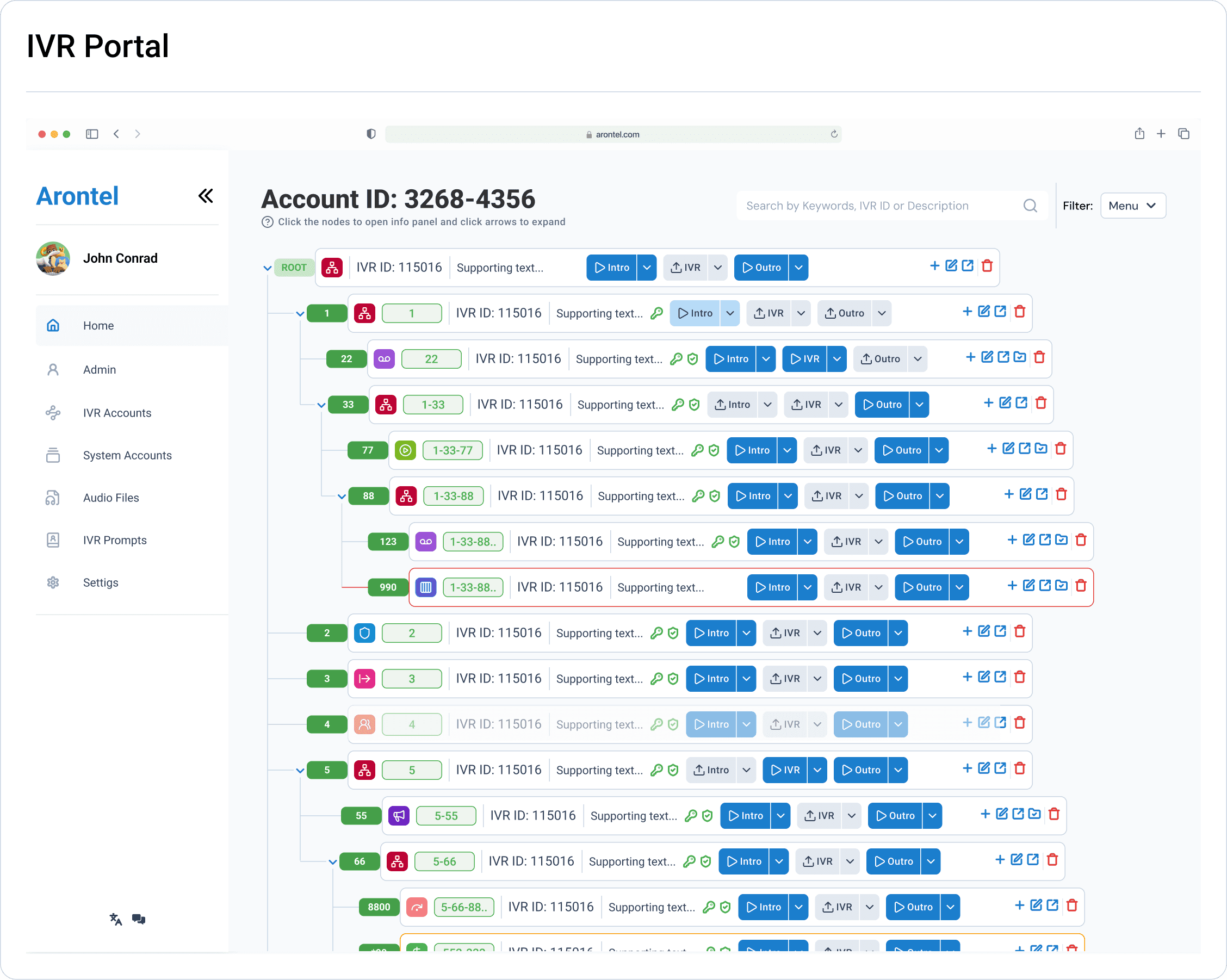
I audited the existing portal, reviewed the legacy codebase, and conducted a heuristic evaluation to flag key UX issues.
Heuristic Evaluation
Stakeholder & Client Interviews
Design and Code Audits
UX/UI Pattern Analysis
Atomic Design Principles
Usability Testing

Collaborating with developers helped refine
Component naming conventions
Token structure
Platform compatibility with Vue.js and Nuxt.js
Design
Every button, every badge is built with purpose, not just show.
What we built
80+ reusable atomic components (Buttons, Badges, Inputs, Tags, Modals, etc.)
Nested variants for edge cases and state management
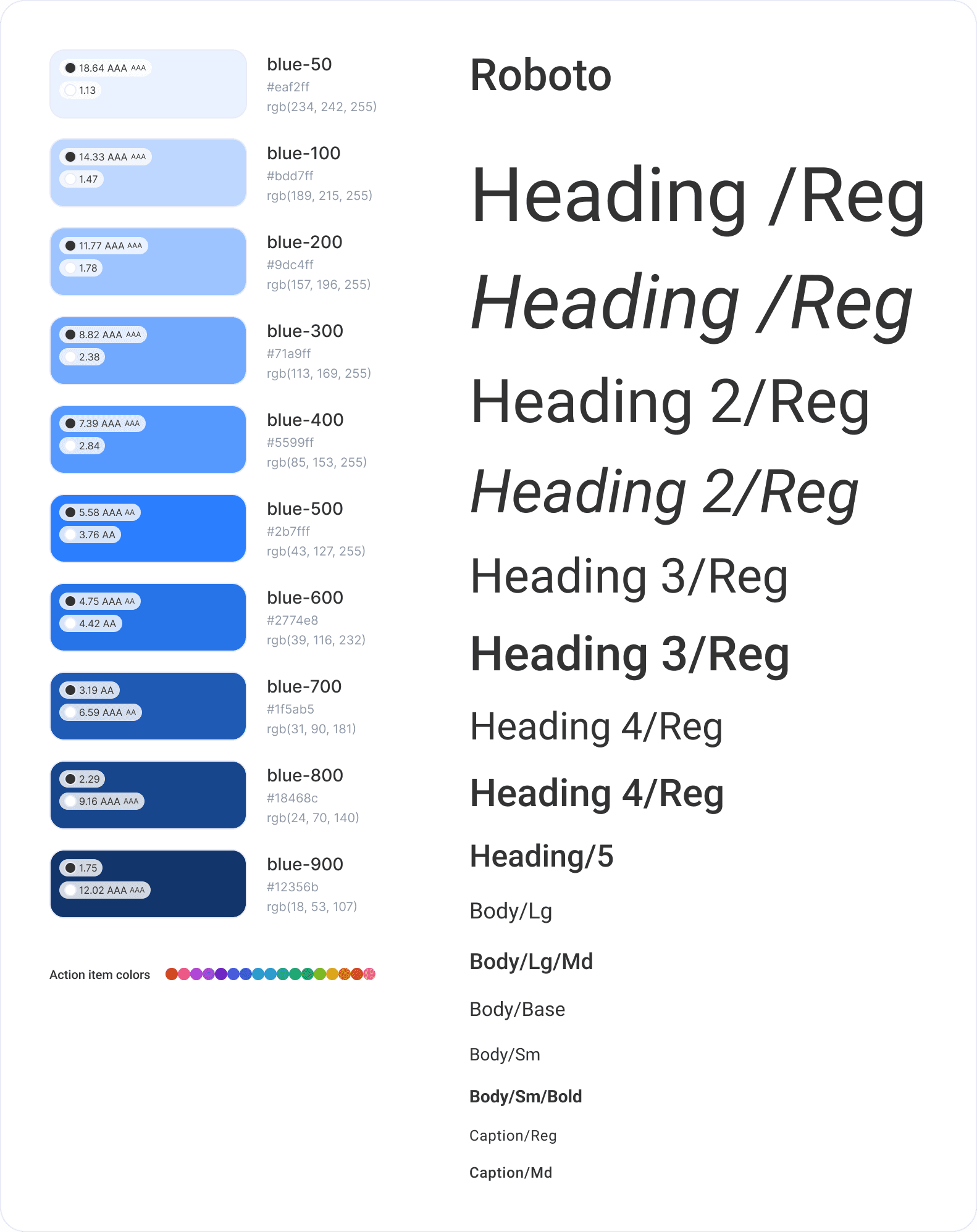
WCAG-compliant color tokens and accessible text sizing
Design philosophy
Components were designed for consistency, making them easy to scan, recognize, and reuse across the system.
Every element was built to be accessible by default, meeting WCAG standards and ensuring clear visibility and touch-friendly interactions.
The system was made scalable from the start, allowing future designers and developers to easily extend and maintain it.


The stakeholders chose a clean and trustworthy blue color palette that reflects Arontel’s voice. For typography, we used Roboto — a modern, highly readable font that pairs well with digital interfaces. The color and type decisions helped bring consistency and accessibility across the redesigned portal.
Prototype
Each round of feedback made the system smarter, faster, and easier to build with.


The system evolved through three major cycles:
Round 1: Established base components. Feedback: “Looks great, but how do we implement it?”
Round 2: Embedded tokens and interaction specs. Feedback: “Now this is useful.”
Round 3: Finalized responsive behavior and added usage documentation
Impact we saw right away
30–40% faster dev cycles
Fewer questions and smoother handoff during QA
SUS score improved by 38%
Task success rate increased by 30%
The design system is still in progress, and constantly being iterated on. With the new components that were implemented, I began to ask: has it improved the overall product?
My dev team shared valuable insights into what was working — smoother handoff, less back-and-forth, and consistent component logic — and where the system still needed refinement, especially in edge-case documentation and framework-specific guidance.
“This is the first time design has made implementation easier, not harder.”
— Developer, Arontel
What’s Next?
The Design system is still work in progress. It’s growing with the team, just like I am.
The design system is still in progress, and constantly being iterated on. With the new components that were implemented, I began to ask: has it improved the overall product?
My dev team shared valuable insights into what was working — smoother handoff, less back-and-forth, and consistent component logic — and where the system still needed refinement, especially in edge-case documentation and framework-specific guidance.
What changed
From design chaos to a shared system
From scattered code to modular components
From designer-to-dev friction to collaborative flow
What’s next?
Expand documentation for Bootstrap and Nuxt compatibility
Create a live-coded component library linked to design tokens
Gather feedback from future designers to improve onboarding
What did I learn from this work?
As the system evolves, I’m focused on creating standardized assets that can be reused across different frameworks. I want to document how each component behaves in Vue.js, Nuxt.js, and beyond. I plan to collect feedback from designers and developers alike to ensure the system stays useful, intuitive, and scalable. Over time, I hope to measure its real impact on team velocity, consistency, and overall product quality.
Design systems aren’t just tools — they’re bridges. They connect people, streamline communication, and help teams build with confidence and clarity.
Disclaimer:
To respect NDA terms and protect brand confidentiality, some visual assets in this case study have been intentionally altered or simplified. The designs showcased are representative of the work and process, but do not reflect the exact production environment of the Arontel platform.